Add a manual or a computed sort (수동 또는 계산 정렬 추가)
What sort type should be used to have sort order Low, Medium, High?
→ Manual
Which of the following are applicable for nested sort in Tableau? – [Select all that Apply]
→ Nested sorts look correct within the context of the pane, but don’t convey the aggregated information about how the values compare overall
→ Sorting from an axis does not give a nested sort by default
→ While creating a nested sort, the sort is inherited when we drill down through the dimensions
(In Tableau a nested sort considers each pane independently and sorts the rows per pane. Nested sorts look correct within the context of the pane, but don’t convey the aggregated information about how the values compare overall. Also, sorting from an axis gives a nested sort by default. When creating a nested sort, the sort is inherited when you drill down through the dimensions. For example, a nested sort on Hue will apply to Colour.
•
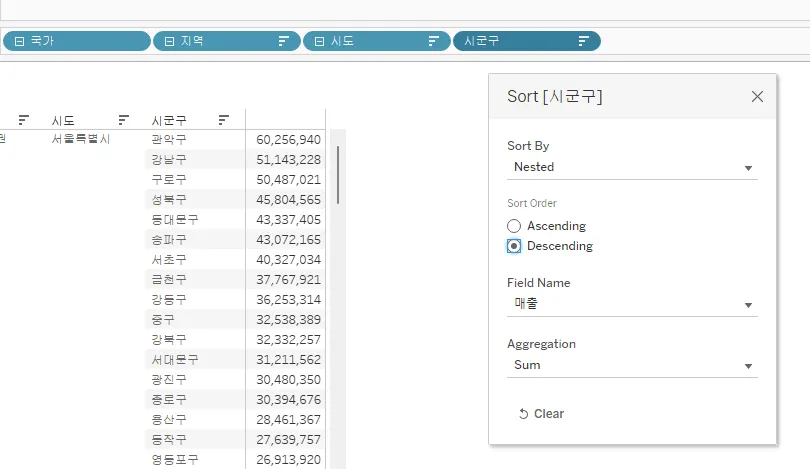
중첩(Nested) 정렬: 앞에것을 포함해서 정렬한다.

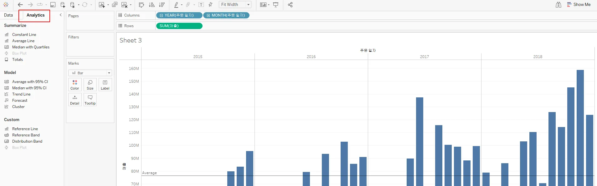
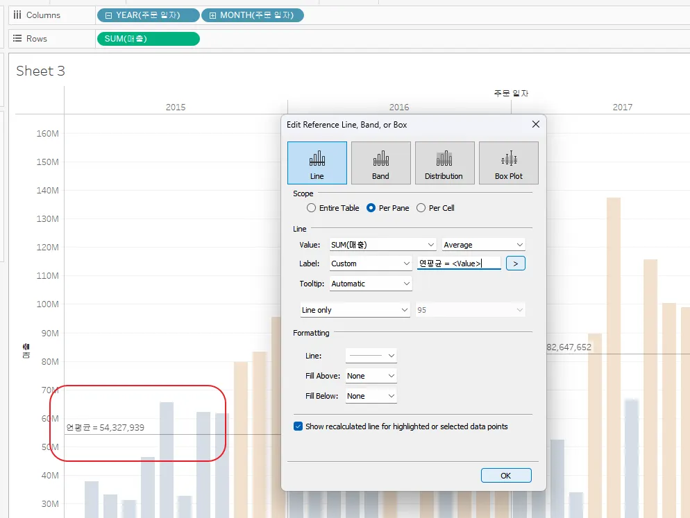
Add a reference line(참조선 추가)
What steps can be used in creating a view with a reference line? [select two]
→ On the analytics pane, click on reference line and drag into the view.
→ On the Show Me menu, select bullet graph
•

Use a quick table calculation (퀵 테이블 계산 사용) 용
Which of the following is a table calculation?
→ TOTAL
What steps would you follow to create a cumulative sum of the values shown in the view?
→ Right-click the pill for the measure in the view, select quick table calculation and then select “running total”
A worksheet has a line graph showing sales by month. How could this be modified to show total sales to date for each month?
→ Right-click Sales, then select the Quick Table calculation menu option, then select running total
Which of the following quick table calculations are available in Tableau? – [Select all that Apply]
→ Percent of total
→ Rank
→ Percentile
(Running total, Difference, Percent difference, Percent of total, Rank, Percentile, Moving average, YTD total, Compound growth rate, Year of year growth, YTD growth.)
•
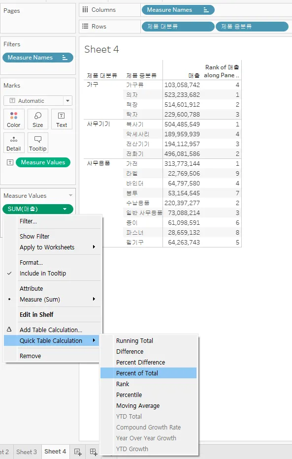
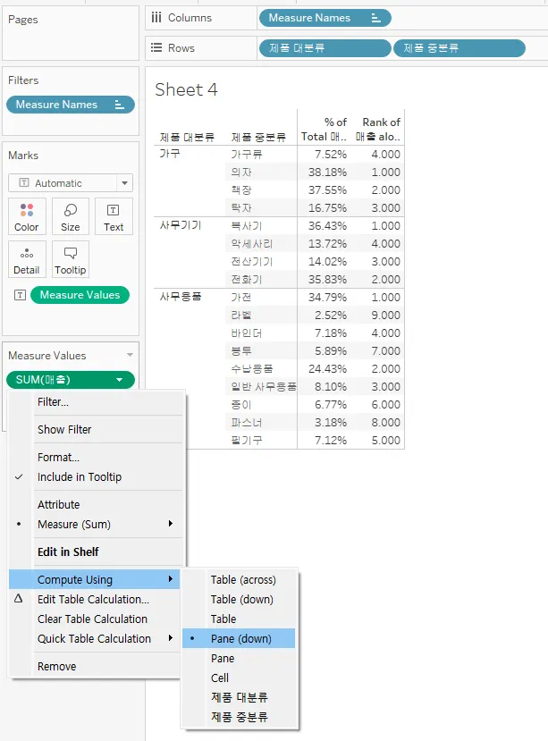
•
전체에서의 순위, %가 아니라 대분류내에서의 순위, %를 표현하려면..
◦
Compute Using → Pane(down) 패널내로 범위 지정.
•
Use bins and histograms (구간 차원 및 히스토그램 사용)
Bins can be created for which type of field?
→ Continuous measure
A histogram shows the distribution of ________ data by creating bins that are _________.
→ continuous, discrete
(A histogram uses bins to subdivide a continuous measure into a discrete bins.)
Which types of plots are most often used to visualize the distribution of a single continuous
measure?
→ Box Plot, Histogram
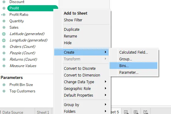
How do you create a Binned Dimension in Tableau? –
→ In the Data pane right-click a measure -> select Create > Bins -> Create Bins dialog box accept the proposed New field name or specify a different name for the new field -> Mention the size of bins -> Ok.
(To create a Binned Dimension in Tableau - In the Data pane right-click a measure -> select Create > Bins -> Create Bins dialog box accept the proposed New field name or specify a different name for the new field -> Mention the size of bins -> Ok.)
•
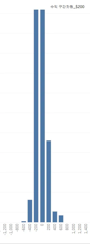
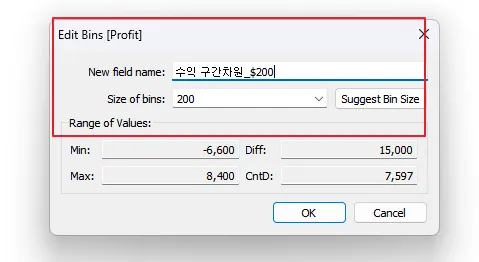
$200 단위의 구간을 만듬.
Create a calculated field (e.g. string, date, simple arithmetic) 계산된 필드 만들기
The main types of calculations you can use to create calculated fields in Tableau: –
→ Basic calculations
→ Level of Detail (LOD) expressions
→ Table calculations
(There are three main types of calculations you can use to create calculated fields in Tableau - Basic calculations, Level of Detail (LOD) expressions, Table calculations.)
•
•
•
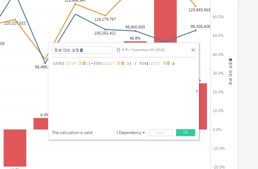
좌측 축에 매출 값을 Drop하면 2개의 그래프가 그려짐…
•
우측 축에 전년 대비 성장률 값을 Drop하면… %가 그려짐…
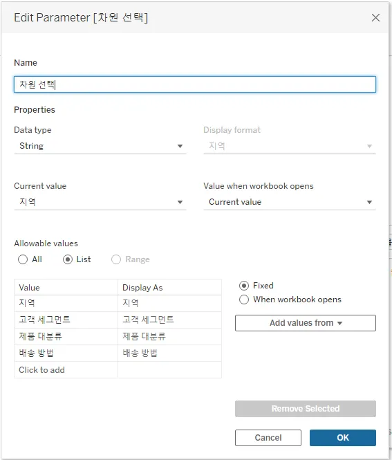
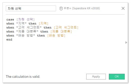
Explain when to use a parameter (매개 변수 사용 방법 설명)
For which of the following tasks would it make the most sense to use a parameter?
→ Allow the user to change the measure shown in the view. For example, to switch from seeing sale per order to seeing the count of distinct customers.
In which case would you most likely want to use a parameter?
→ To allow the viewer to select which measure to show in a bar chart
You would like the person using your dashboard to select the year, and based on the year to
adjust the interest rate in some related calculated fields. You will like the year selection to limit the data in the view. What Tableau element should you to let the user select the interest rate?
→ Parameter
Which type of visualization is not typically effective in showing change over time?
→ Some of the best visualizations for showing trends over time are line charts, area charts, and bar charts.
Which of the following could best be accomplished using a parameter?
→ In a view showing the top customers, allow the user to show how many customers to
show
→ Allow the worksheet viewer to adjust the bin size for a histogram
Which of the following can prevent a refresh for a refreshable list of parameter values? [select all that apply]
→ The default field returns null.
→ The default field is in a data source that’s not yet connected.
→ The user cancels the query to the data source while Tableau is attempting to connect.
(As explained here, https://help.tableau.com/current/pro/desktop/en-us/parameters_create.htm#when-the-parameter-value-or-list-of-values-can’t-refresh will cause the list to fail to refresh. A single value is required when setting the parameters default value, but not when dynamically setting a list of possible values for the parameter.)
•
매개 변수는 단독으로 사용할 수 없기 때문에 계산식과 같이 사용한다.
•
•
•
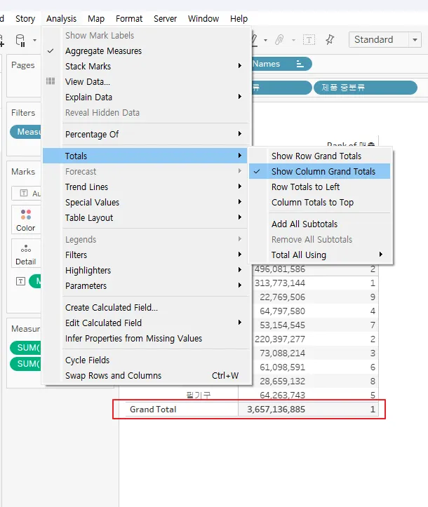
Display totals on a worksheet (워크시트에서 총계 표시)
A worksheet with a text table has the dimension PRODUCTS and the measure AVG(Discount). If totals are added to the worksheet, what default method will be used to calculate the totals?
→ The average of discount per row in the underlying data source
What Total All Using option was chosen for the following view?
→ Minimum
How would you add the overall sales for all segments to the text table shown below?
→ Select Analysis on the toolbar, select Totals, then show Column Grand Totals
How to show subtotals in a visualization in Tableau –
→ Click the Analytics pane -> In the Analytics pane under Summarize drag Totals into the Add Totals dialog -> drop it over Subtotals
(To show subtotals in a visualization: Click the Analytics pane and in the Analytics pane, under Summarize, drag Totals into the Add Totals dialog, and drop it over Subtotals)